Choice of graphical representation of distributions
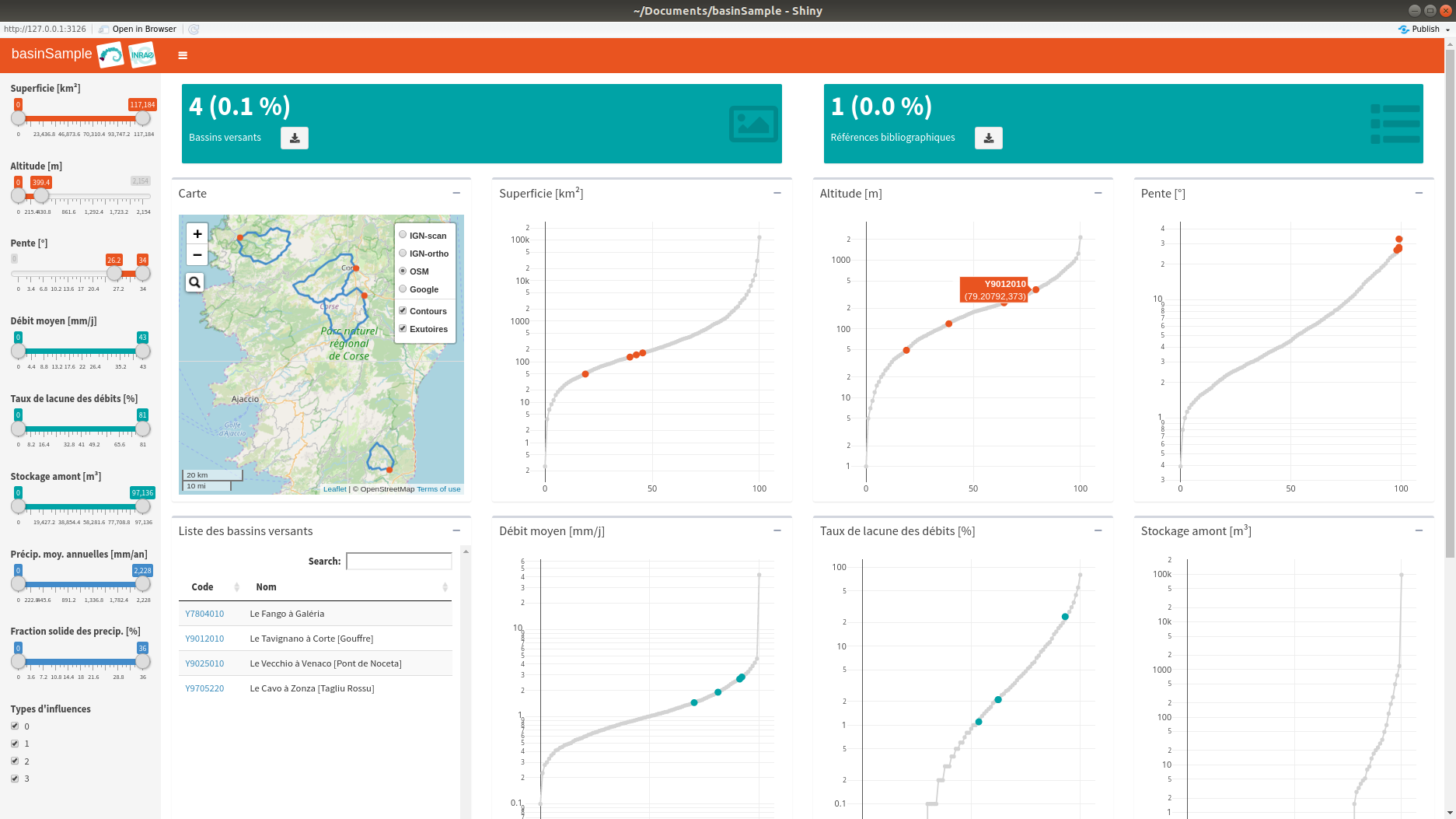
@benoit.genot, I tested the interface with all available basins (> 4000). When you manipulate the interface, the reaction times seem correct at first. But as soon as you play with it a little, troubles start to appear. Maybe it's due to memory management.
When a large number of basins are selected and you move the sliders several times, after a while it takes a long time to update the graphs. Moreover, when zooming on a graph, it makes troubles when the user the double click in order to return to the initial the plotting region.
Perhaps it would be better to draw histograms rather than empirical cumulative distributions. The disadvantage is that it will probably no longer be possible to identify the basins on the graphs (thanks to a label, see screenshot below). When there are many basins, one possibility is not to plot the the whole set of points that are in the middle of the distribution. In this case, the possibility to zoom in on the graphs loses its interest.
@charles.perrin, what do you think about?
Code modifications to run the test:
#! basin contours
pathCont <- file.path(pathSrc, "contours/4190BVs_FRANCE_WGS84_2018_simple")
#! criteria : file with criteria for each basin
criteria <- read.table(file = pathCrit, header = TRUE, sep = ";",
stringsAsFactors = FALSE, encoding = "UTF-8", quote = "",
comment.char = "")
criteria[!complete.cases(criteria), -1] <- criteria[1, -1]